

Yo how’d our hommie sideofburritos get old school quick access on GrapheneOS? Is this just an old version? The video’s only a year old! So I’m on GOS Android 13 (aka big dumb quick access button purgatory), totally confused and totally jealous. I can only imagine an out of touch board testing a new android version and telling the developers to make the buttons bigger and dumber while they tell their managers “okay, we can do that” while they die a little inside. This is the most egregious design offense committed in the history of AOSP.
Please tell me this can be fixed with System UI Tuner or some other bullshit that doesn’t kill my battery life or privacy.
Are you saying you like the big buttons? Because Android 12 is when they were introduced.
I do like them
yeah I do and Im tired of pretending I dont
I’m confused. Quick access was introduced in Android 4 and those buttons were huge.
More like Android 2.3! And those buttons were also pretty huge for the 3" screens phones used to have.
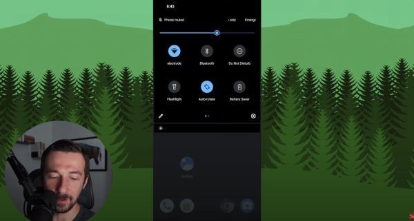
However, I can see someone getting annoyed at the huge buttons because Android has restricted the number of quick toggles in the notification shade to 4. while previously you could have 6 (or about 5 on Android 11), and there’s definitely space for more if you have a modern phone. Phone screens have doubled or quadrupled in size and yet we have half the toggles available without dragging down with a second gesture, that is a little annoying.
The new buttons do provide a better UI, but I can see why someone would want to stuff more of them into the same screen.
Gosh, yeah. I vaguely remember having a custom ROM for my ZTE Blade which gave me quick access icons. Seem to recall I could display certain widgets there, too.
Sorry, Android 12 added the new Quick Setting tile called “Internet” that combined the Wi-Fi and Mobile Data tiles. Yeah you’re right, I had big square QS buttons on my old Galaxy S4 but when I switched to Pixel it had the small circular buttons for a short period.
No oops, I hate it. I think Android 11 was it when it was just working.
I liked the small circular QS buttons best from everything they’ve put out so far. If they brought those back and had an option to remove the button titles, I’d be happy.