

That graph is insane
cries in Canadian
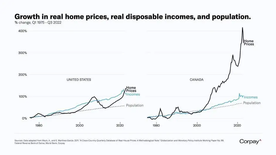
This graph is so location dependent for the US. Where I am, home prices have gone up well over 10x since 1980. There are many places in the US where it is just as bad, or even worse than the average in Canada.
Did they stop making houses in Canada?
Recently saw the house Taylor Swift grew up in. Amazing mansion that would cost $2M in Canada or the Netherlands.
But it sold in 2022 in the USA for $800K.
The higher interest rates and property taxes keep the price of US homes a bit more reasonable than in Canada or the Netherlands.
And (as I understand) those are deductible for the income tax in the US, so working people have a tax advantage that investors don’t have.
In any case, taxing property and lowering income tax seems like it would help working people afford homes relative to investors. It seems like a politically good move, too.
This is what a bubble looks like.
This is what a government enabled bubble looks like that has no interest in “solving” the issue.
This was the slowest moving train wreck I can think of.
With inflating house prices contributing to GDP figures, how much interest do you think the government will have in tanking the market to take from the haves and give it to the have nots?
As with any essential good/service (looking at you, US healthcare) commodiying housing was a catastrophic mistake. The essential nature of it inevitably creates market failure - the consequences of which are plain to see in that graph.
Dataisterrifying
Not if you buy at the dips like I did.🙃
Someone better at such things than me needs to add a trendline for the ratio of median employee to median CEO earnings for publicly traded companies over the same period of time. Maybe it wouldn’t look like I think it would - but maybe it would.
wot dey doin ova der?
This graph would look much different if it compared home prices in 2022-2023.
What do you mean
New Zealand says hello.
This is definitely an average. Top earners dragging up the average makes it a shit number to use in most economical statistics. Median is better for income figures almost always these days.
Still shocking that Canada is this much worse than the US. It’s also horrible here.
So, are we screwed?
Does anyone else see this post with -1 downvotes?
Yeah, but that goes for and bubble that has roots in some sort of legislation. The tech bubble is probably most recent that wasn’t government related.
I hate it when the chart doesn’t say what it depicts. I assume those are averages, not median. The average hides that fact that most people’s real income has barely grown in 20 years. All the income growth comes from the top 20% or so, you don’t see that in the average.


